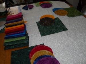
My proposed colour way for mod mod-full
I’d love some input here from those with experience- do you feel
the cream TOT as background will make this too bright and in your face? Do you think a darker background would work better ie. a cardboardy tone beige? My Fabrics are pretty bright. I want to start sewing and I really need to get cutting but, I am not experienced and I am hesitating here…sometimes that is a red flag for me so I thought I’d put it out there and just ask for opinions.


I don’t think there’s a right (or wrong) choice for you. The lighter background will make a quilt with higher contrast; a darker beige will feel warmer/earthier. Which is the look you want?
Your fabrics are gorgeous. I look forward to seeing what you decide to use for the background and following the progress on your quilt.
Thank you Sophie for your explanation and for everybody elses (that I wouldn’t have if the site wasn’t here)..I am so glad I asked because now I feel confident that I am on the right track for the feeling I’m after with this quilt. Although I have been more of a traditionalist in the past, when I saw the quilts Andrew led to I knew I was after that kind of feeling. I didn’t quite understand what I was seeing or how to interpret that feeling with the fabrics now, I’m pretty sure I do. Sophie, it’s going to be Mod_Mod all the way! Thank you for your patience.
I think what you have there looks very nice, particularly with the pinks, blues and purples.
Thank you Kathy for taking the time to comment. It has been an exciting journey for me and I am learning so much about fabric , textures and colour. I am continually surprised by how well different colours can look together! It is so exciting, I am a little scared that my choices might end up looking really gaudy but, I do like the bright bold ones, they make me feel very happy and energetic. I am definitely leaning towards this combination now for the sake of synchronicity. Everything Mod- Mod. LOL
I think the white is perfect and I’ll bet you end up loving it!
Thank you Toni, I sure hope so because that is the way I am leaning…the white pictured has a little creaminess in it and comments have bolstered my courage and I have pretty much decided to go Mod-Mod. LOL
I agree with Sophie. I think what you have there looks great! But that’s just the kind of quilt I like. In my opinion the higher contrast gives it a more “Modern” feel. Lower contrast feels more traditional to me.
That’s good to hear Andrew! I have never been let down by Sophie’s advice in the past. I saw some quilts you posted re fabric giveaway and it was like a light clicked in my brain and I said to myself, “Self, I want to make something that feels like That!” Sophie and your explanation has really helped me clarify what I am aiming for. I get it now …(Higher Contrast)- more Modern and (Lower Contrast)- more Traditional…I like both but for this one I’m pretty sure its Mod- Mod. Thank you for taking the time to sort me out.
I would be making my choice depending on what I want to achieve. If it’s to be a bright, dynamic and modern looking quilt, your background choice is fine. A cream or gray will still preserve all your color choices, but they won’t pop quite as much. I often use a warm golden-yellow for background because I live in the frozen north and sunshine here is always welcome! Your fabrics certainly look great.
Elizabeth thank you for your comments, they are spot on everyone else comments. They have all helped me to understand colour and its’ affects on us. Being new to quilting I find I am second guessing my colour choices and that isn’t relaxing. I want this to stay fun…I have to say here, I am having a kick with it all and that I appreciate everyone’s input…without it I’d be sunk! The thought you shared about Frozen North , I can relate to that…It has been a hard winter here too and the white pictured does have a bit of creaminess to it…not a lot but certainly some. I’m going with it…Mod-Mod all the way!