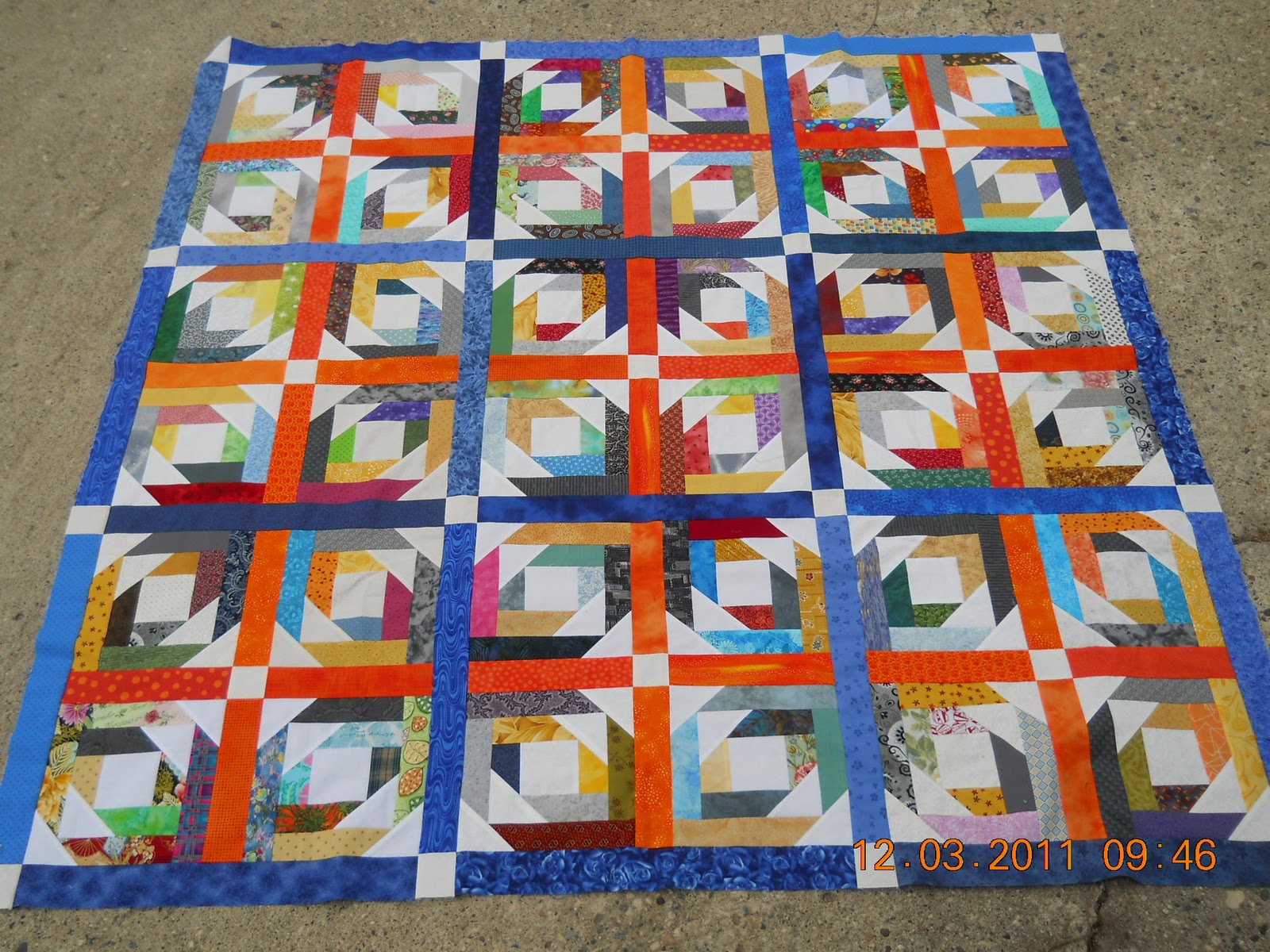
The blocks I won are in a top and it will be going to the quilter real soon.
So there is time to think about…..
What color binding???
Julie P.
14 Comments
joe tulips
December 5, 2011 at 6:11 PM
p.s…..Three blocks are sewn together for a dresser scarf. Not sure on how to finish it, and I haven't taken a picture yet.
Kathy
December 5, 2011 at 6:49 PM
Love the sashing! It looks so modern and fresh. But then I loved the way Bonnie that won did hers too. I'd go with an orange border. I need to dig out mine soon. I won that month too!
Linda Big D
December 5, 2011 at 7:00 PM
I. Suggest your darkest blue, so the focus stays on the middle.
Sandi P
December 5, 2011 at 7:09 PM
Love the way you did the sashing. I might have to do something similar when I dig out my stack. I would do the orange for a binding to tie it all together.
Tina ~ Seaside Stitches
December 5, 2011 at 8:36 PM
Love your blue and orange sashing. Maybe dark gray for binding to tie in with the grays in the blocks.
rho
December 5, 2011 at 8:37 PM
Uh – uh….Use the same blue as the sashing for the continuity there and to keep the focus on the middle of the quilt. A different color binding, seems to me would be distracting. rho's 2 cents!
Michelle L. Momof11
December 5, 2011 at 10:23 PM
I vote for an orange binding….or maybe the blue…but then again a scrappy binding might work on this too… I think you are going to have to try them to see which works best….LOL!!!
Michelle L. Momof11
December 5, 2011 at 10:23 PM
I vote for an orange binding….or maybe the blue…but then again a scrappy binding might work on this too… I think you are going to have to try them to see which works best….LOL!!!
Kathryn
December 5, 2011 at 11:35 PM
Your orange and blue sashings really pull it all together. I think that I'd go with blue binding. Kathie L in Allentown
sophie
December 5, 2011 at 11:46 PM
Like, Tina, I initially thought about using a gray … but the more I thought about it, like Michelle, I could see blue or scrappy or … yep, I think when you audition some possible fabrics, you'll "see" the answer. Thanks for sharing your quilt.
Karin
December 6, 2011 at 1:31 AM
my vote is for a gray binding 🙂
Cathy (aka CrafteeCC)
December 6, 2011 at 3:16 AM
this is wonderful 😉 my first thought was grey, then I thought blue … but I wonder what it would look like with white binding …. would it make the blue borders pop more, or make the diagonal crosses pop more ??? this is the part I hate … auditioning bindings – you will know it when you see it 😉
Karen
December 6, 2011 at 3:30 AM
I really didn't like that block when I first saw it, but I love that quilt top. I think the binding really brings it together and the cornerstones bring out the white in the block. Great work!
Pat from FL and MI
December 6, 2011 at 3:55 AM
Your setting really makes these blocks look great. I had a hard time seeing these blocks in a quilt before. I'd go with orange for the binding.
p.s…..Three blocks are sewn together for a dresser scarf. Not sure on how to finish it, and I haven't taken a picture yet.
Love the sashing! It looks so modern and fresh. But then I loved the way Bonnie that won did hers too. I'd go with an orange border. I need to dig out mine soon. I won that month too!
I. Suggest your darkest blue, so the focus stays on the middle.
Love the way you did the sashing. I might have to do something similar when I dig out my stack. I would do the orange for a binding to tie it all together.
Love your blue and orange sashing. Maybe dark gray for binding to tie in with the grays in the blocks.
Uh – uh….Use the same blue as the sashing for the continuity there and to keep the focus on the middle of the quilt. A different color binding, seems to me would be distracting. rho's 2 cents!
I vote for an orange binding….or maybe the blue…but then again a scrappy binding might work on this too…
I think you are going to have to try them to see which works best….LOL!!!
I vote for an orange binding….or maybe the blue…but then again a scrappy binding might work on this too…
I think you are going to have to try them to see which works best….LOL!!!
Your orange and blue sashings really pull it all together. I think that I'd go with blue binding. Kathie L in Allentown
Like, Tina, I initially thought about using a gray … but the more I thought about it, like Michelle, I could see blue or scrappy or … yep, I think when you audition some possible fabrics, you'll "see" the answer. Thanks for sharing your quilt.
my vote is for a gray binding 🙂
this is wonderful 😉
my first thought was grey, then I thought blue … but I wonder what it would look like with white binding …. would it make the blue borders pop more, or make the diagonal crosses pop more ??? this is the part I hate … auditioning bindings – you will know it when you see it 😉
I really didn't like that block when I first saw it, but I love that quilt top. I think the binding really brings it together and the cornerstones bring out the white in the block. Great work!
Your setting really makes these blocks look great. I had a hard time seeing these blocks in a quilt before. I'd go with orange for the binding.