Did you see . . .
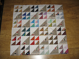
 I saw this quilt on Kate’s blog yesterday . . . and hope she doesn’t mind that I’m sharing it here.
I think it’s a great setting idea for anyone who wins a set of blocks this month and wants to make a bigger quilt (without making a bunch more scrappy triangles blocks) OR wants to “push” the colorway of their finished quilt in a specific direction, or just calm it down with something neutral.
I made personal note of her quilt because I have cut extra triangles and plan to make a scrappy throw from them . . . it could end up looking a lot like Kate’s if I get tired of cutting and sewing those 3″ half-square triangles 😉

Nice layout!!
Thanks for sharing! I really like the big and small effect.
I like the larger plain spaces because it gives the eye a place to rest. I had the rare pleasure to tour the Dallas Quilt Show with Sophie and Saturday, and we noticed many fabulous quilts that could have been improved design-wise with a few more blank spaces, and the proliferation of the darker colors (aka Civil Way colorways) over creams and whites as backgrounds. The other nice thing about these blank spaces is they provide really nice spots to show off the quilting, which too often get hidden when there is too much piecing or pattern.
It’s interesting that at the show on Saturday, I was either walking around with you or my friend from work, Karen, whose comments were about how many of the quilts needed more contrast. Of course there were many lovely quilts … we weren’t picking apart ALL of them 😉
Thank you, Sophie. This is VERY helpful (in case I ever do win, ha-ha). No, really. I think this might inspire me to make those HST from my scraps. Christa
What a great idea! Thanks for posting — I’m starting to cross my fingers already. March will be over before we know it.